
This is the fourth article in a series. The series is about errors in BHS and/or WLC. The other articles in the series are as follows:
This article is about:
(Galgal is also known as yeraḥ ben yomo).
Here’s the basic story:
So we can see that atnaḥ hafukh and galgal are conflated by BHS. In BHS:
The BHS editors were not the first people to conflate these accents. Indeed, this conflation precedes the era of printing! But, due to its great popularity, BHS is primarily to blame for this conflation’s persistence down to the present time. Thankfully, this conflation is not universal. As other articles in this series have shown, there is a sphere of publication and scholarship, mostly Israeli, that has escaped the great gravitational pull of BHS and WLC. In that sphere, there is no such conflation.
Let’s look at the first few words of Psalm 5:10 in “MAM with doc” (Mwd), an edition that takes more care with accents than BHS does (color added):
We see that in Mwd, the words אין and קרבם have different accents. The accent on אין is galgal and the accent on קרבם is atnaḥ hafukh.
Now let’s verify that Mwd corresponds to three great manuscripts. Here are the first few words of Psalm 5:10 in Ms א, Ms ל, and Ms ש1 (aka שׂ (sin)) (aka Sassoon 1053). (Thanks to tanach.us, Sefaria, Bar-Ilan U., and IHBMR for hosting and/or indexing these images.)
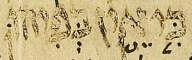
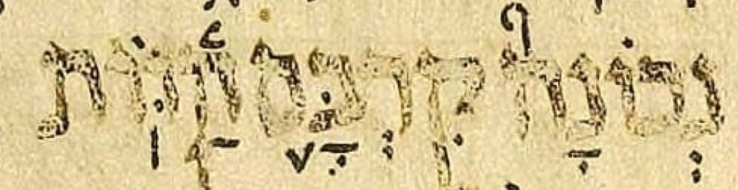


We see that Mwd corresponds to the manuscripts, modulo the shape of atnaḥ hafukh. In Mwd, which uses the Taamey D font, atnaḥ hafukh is what we might call a tuning-fork-shaped mark as opposed to the V-shaped mark we find in the manuscripts. This is like the well-known difference in the shape of atnaḥ between some printing traditions and the manuscript tradition.
Now let’s see what these accents look like in BHS:

We see that in BHS, the words אין and קרבם have accents with the same shape: an inverted atnaḥ. The BHS table of accents identifies this inverted atnaḥ shape as “galgal vel jèraḥ [ben yomo].” According to modern scholarship, this is wrong.
Perhaps we should think of pre-modern scholarship on this topic as as merely imprecise, not wrong. In that light, I suggest that when pre-modern scholarship refers to galgal or yeraḥ ben yomo, we should read this as “galfukh,” a portmanteau created from galgal and atnaḥ hafukh. “Galfukh” is a kind of perpetual qere for pre-modern scholarship on the Hebrew Bible.
Once “galfukh” is substituted in, most of what pre-modern scholarship says about galgal is not wrong. It becomes merely imprecise rather than wrong. For instance, when Wickes says, on page 57 of his treaties on the poetic accents:
The servus of Olév’yored is [...] Galgal.
We should read this as:
The servus of Olév’yored is [...] Galfukh.
Similarly, when Wickes says, on page 88:
When there is one [servus of Pazer,] it is Galgal
Although that is not wrong even according to modern scholarship, we should read it as:
When there is one [servus of Pazer] it is Galfukh
Galgal as distinct from AH is not a valid concept in pre-modern scholarship, so we should never read Wickes as meaning galgal in the modern sense when he writes “galgal.”
Similarly, when reading the BHS table of accents (both the prose sub-table and the poetic sub-table):


We should read “galgal vel jèraḥ [ben yomo]” as “galfukh vel galfukh.” Since “vel” is Latin for “or,” we algebraically simplify this to “galfukh,” yielding:


The conflation of AH and galgal is further complicated by poor font support for galgal. In the documentation for my Taamey D font I write, “BHS is so influential that even its shortcomings still reverberate through the Biblical world, showing up not only in other editions of the Hebrew Bible but also in fonts!” To be fair to BHS, another important contributor to the poor font support for galgal was the somewhat-botched way in which support for a distinct atnaḥ hafukh was added to Unicode.
WLC faithfully transcribes BHS with respect to these issues. WLC uses the code 93 to represent BHS’s galfukh accent.
In its 19 Oct 2021 release (version 1.3), UXLC broke away from its WLC roots by starting to distinguish AH from galgal. But to make this change visible in UXLC’s canonical edition, tanach.us had to start using a new font. Otherwise, the distinction newly made in the underlying Unicode would remain invisible, since both AH and galgal would continue to be rendered with the same inverted atnaḥ shape. That’s how hard it is to escape the “gravitational pull” of BHS. Even if you try to distinguish AH from galgal, most fonts will thwart you! With that, I conclude this article.